Set dressing and avoiding copyrights
One of my many responsibilities as producer is to make sure we don't come across any copyright infringements. The rooms at our hotel have copyrighted artwork hanging in them, so we need to cover them up with original, non-copyrighted artwork.
Having a background in theatre, I decided it would be easiest to paint these originals on pieces of muslin fabric. Muslin is a lightweight cotton cloth that is an off-white color. It's inexpensive to purchase and easy to work with. At a local fabric store it should cost you around 99 cents a yard and our particular fabric happened to be a yard in width also. Muslin is used in theatre mostly to paint scenery. If anyone has seen "The Honeymooners", they used muslin covered frames, (aka soft flats), which is why the walls wiggle when the door shuts.
Another benefit of us using muslin is that it won't take up much space in the car on the way to Vegas. We will be packing 4 people, their luggage, and ALL of our equipment, (lights, props, crane, dolly, wardrobe, etc.), into Carleton's mid-size SUV. It will be cozy, and there wouldn't be room for anything delicate/ fragile, like a painting on canvas board. Muslin can be easily folded, rolled, etc. and won't take up any space at all.
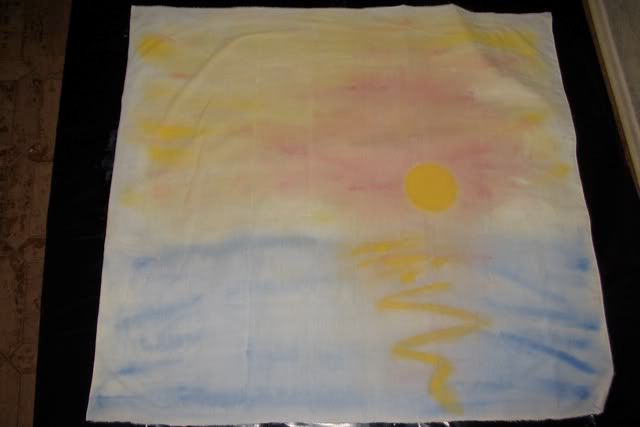
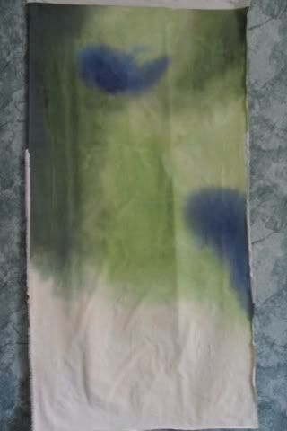
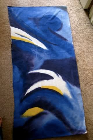
You can paint muslin with pretty much any kind of paint. I chose to use acrylic fabric paint, because that way we could roll/ fold/ spindle/ mutilate the finished piece and not worry about paint possibly coming off. While painting, I used a technique called wet blending This is a technique where you blend the colors together while the first application of paint is still wet. You can use a spray bottle to keep it damp. I used this predominantly on the sunset, but also in the other two. I used another technique on the green one called scumbling. In this technique, you use a series of unorganized overlapping strokes in different directions. The blue one is a little bit of everything.
As Im sure youve already guessed, I am the artist who created these. In order to create something both Carleton (Director) and I (Producer) both liked, I did research into various painters and paintings online to come up with inspiration. I had a lot of fun working on these, and am rather proud of them. It's difficult to tell from the pictures, but these are all fairly large scale paintings. The first one is about 3'x3' and the others are about 3'x 18".
posted by Rebecca - Producer @ 3:11 PM
![]()

0 Comments:
Post a Comment
<< Home