The Production Design
 Since we don't have a colossal budget or any corporate sponsors for this film, I have taken it upon myself to do the production design for some key props. Since my goal is to submit this to various film festivals and eventuality self-distribute it on DVD, I need to be sure I don't have any unauthorized copyrights or trademarks in my movie. That means that any prop I had written into the story needs to have an Alter-Ego version (or Bizarro version, as I call them). With each of the following props, I have taken their existing logo/design and tweaked it to the point where it is no longer infringing on the existing look. Case in point: a bottle of Jack Daniel's Whiskey.
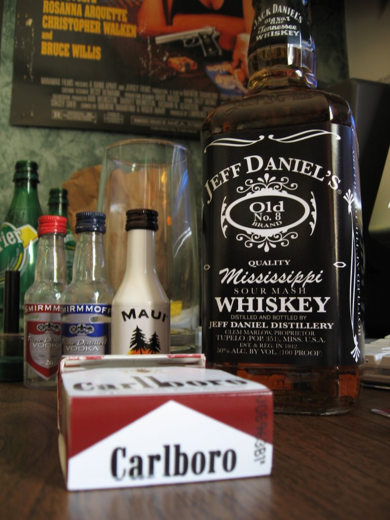
 As you can see, the bottle no-longer says "Jack Daniels". It is now, Jeff Daniels. A few other key differences are: Old Number 7 is now Number 8, Tennessee Sourmash is now Mississippi Sourmash and the general decoration around the label is different.
It was relatively easy to do this all in Photoshop. All I did was measure the existing bottle's label, create a new project in Photoshop with those dimensions, and add the text accordingly. The shapes are all variations of the pre-existing shapes that can be created with the "Shapes Tool" in Photoshop. When I was done, I saved it as JPEG and had it printed at a local photo lab. Altogether, it cost me about $3 plus the cost of the alcohol.
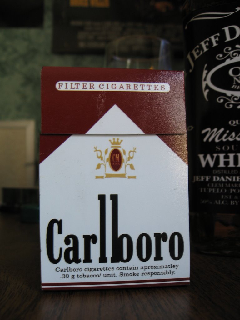 The next product is a box of cigarettes. I don't really want to promote smoking, but I felt it was necessary for the story to have the main character smoke. This prop was a little harder to make than the Jeff Daniels label. I had to first measure the width of the box of cigarettes, then I had to measure the length of the entire box. My end result was a Photoshop project about 9 inches long by 2 inches wide. (Image on right, feel free to use in your own production)
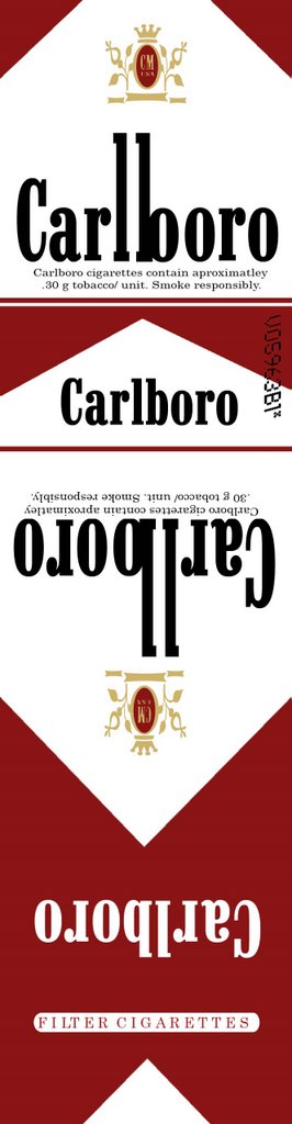
The font I used was actually a font I downloaded for free from Typenow.net called Marlboro font. Unfortunately the lowercase "b" in that font wasn't long enough to match the long "l" in my logo. So the "b" on my package is actually an "l" with an "o" stuck on it. Once again, I made a look-alike logo with the shape tool and added some warnings about smoking to the bottom. I copied and pasted 3 of these onto an 8" by 10" size project and printed it out as an 8x10 at the photolab. This way I had 3 for the price of one. (In case I need to make back-ups).
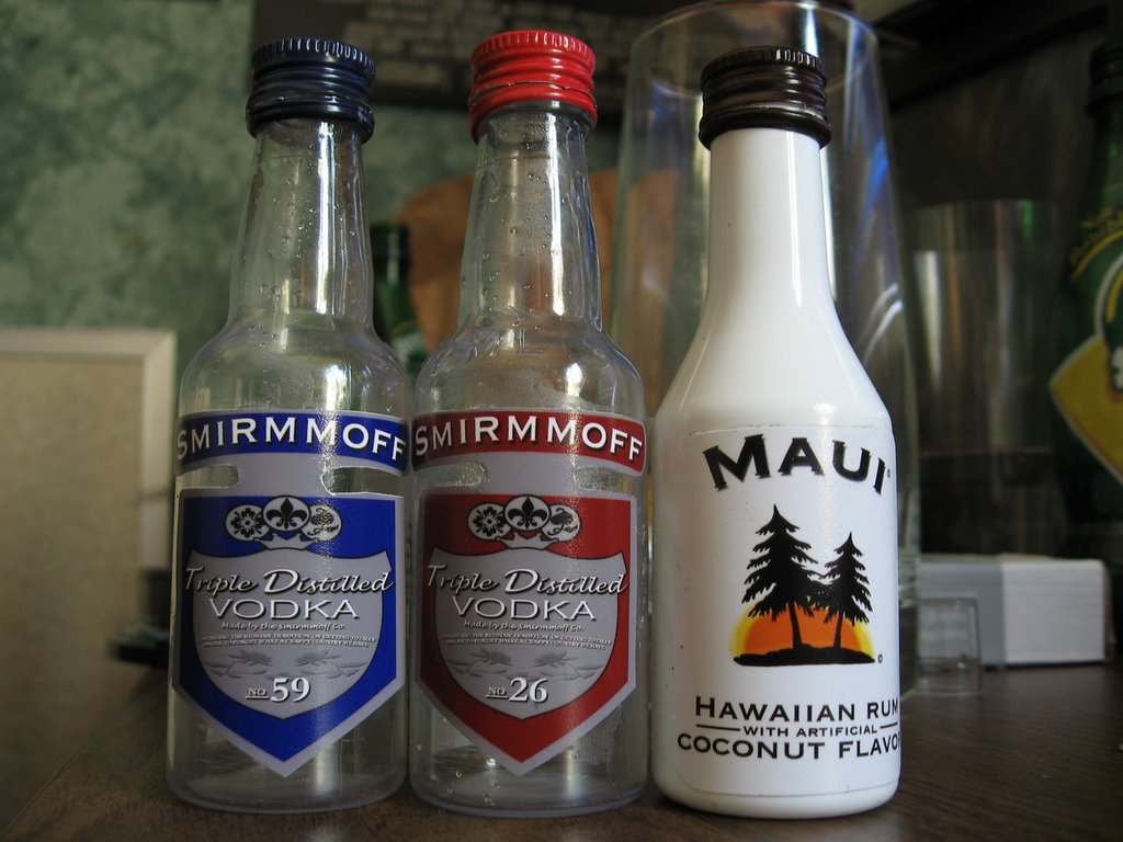 I know what you're thinking. "Is this movie just about characters getting loaded and smoking?", well, not really. But they do drink and smoke, as people in Vegas are apt to do. These are the little alcohol bottles typically found in mini-bars in hotel rooms. I had to make a few different kinds for the movie. The first 2 are just Smirnoff rip-offs. I followed roughly the same procedure of measuring and printing as before, but this time, I had to make 2 different kinds of labels. I made the blue one first, then I just did a color switch for the red one. (I also changed a number on it). The Maui Rum bottle was pretty easy as well. The trees are standard shapes in Photoshop and I just created an orange half-circle behind them. To that circle I added an "Outer Glow" effect and it looked just great. When I was done with all 3 of the labels, I put as many as possible onto an 8x10 sheet and printed them at the photolab. So, for the cost of 3 8x10 pictures at a photo lab, I got plenty of props that need absolutely no legal clearances! What a deal!
Well, that's all for now. Tune in again tonight for another exciting adventure!
posted by Carleton - Director @ 4:16 PM
![]()

0 Comments:
Post a Comment
<< Home